The bronze frames around the doors and windows also are shiny and much more vibrant in colour in that rendering. The real product is sad, dull, and quite dark, not the shiny-ish dark gold-like look pictured here that would have broken up the monotonous dark facade. The floor and benches/planters are also of different materials in the rendering (might be the lighting in the render.)
Quote - Best selling condo in NYC. Not a surprise to me at all. I thought the exterior looked great and the interiors were some of the best I’ve ever seen.
I agree. The dark facade looks fine, and the texture is an added visual affect. I only would change the color of the arched window frames to a brighter color metallic bronze/gold - that would have been a nice contrast and added some ‘glitter/bling’.
I have seen the interiors: the arched window bring in plenty of natural light - and the arch looks very elegant as an interior design feature.
The is one of the best new condo developments downtown IMHO.
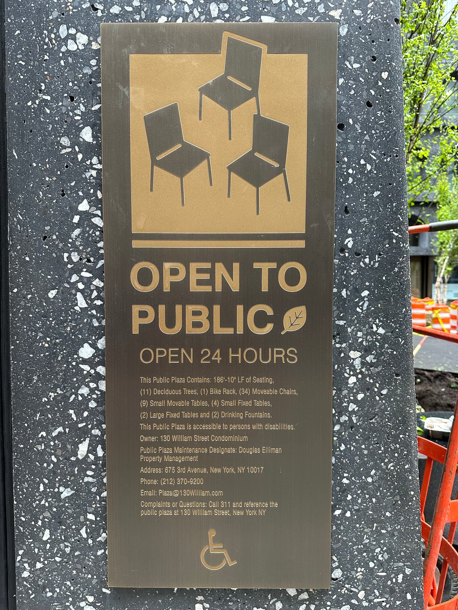
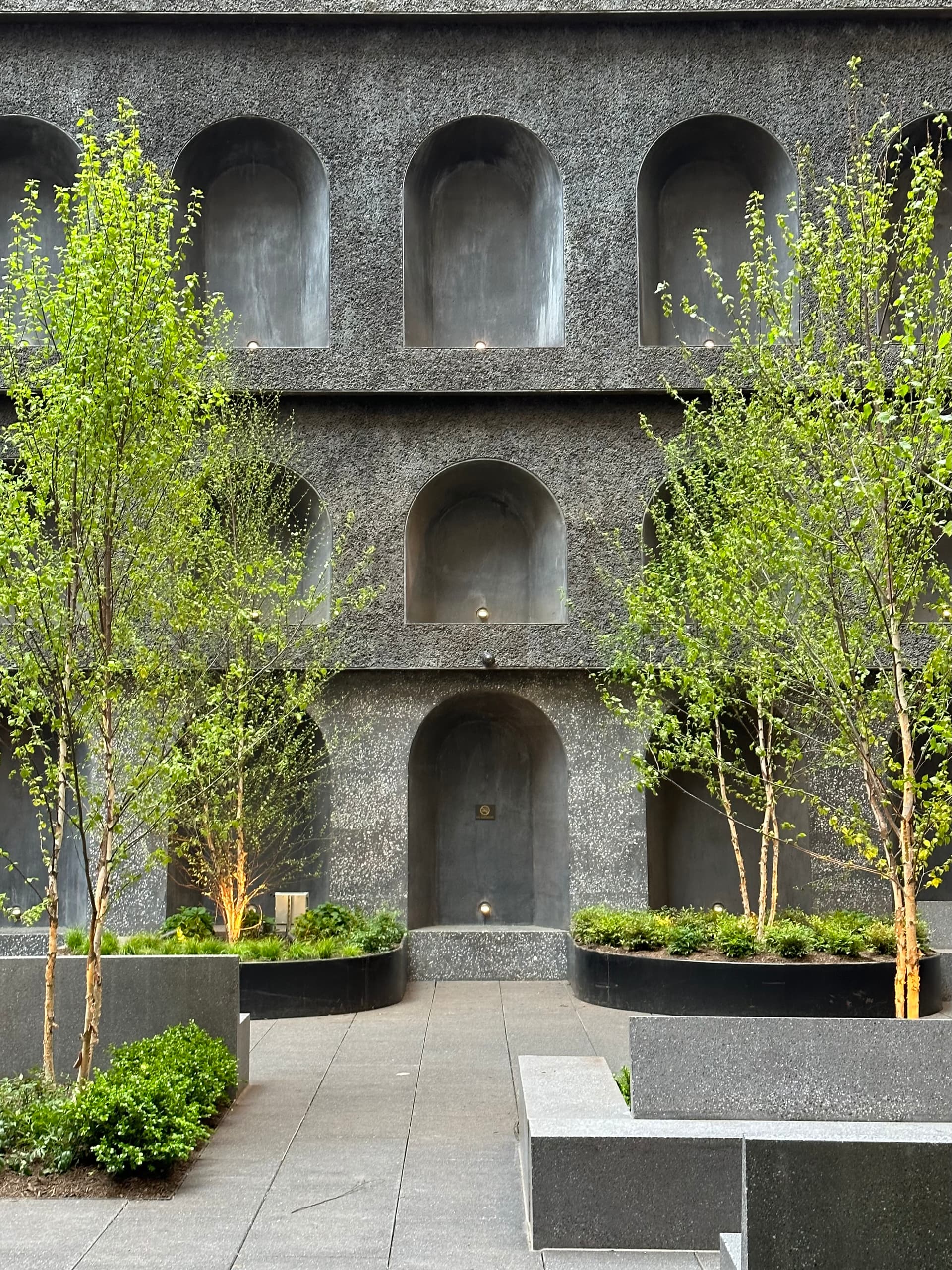
I know some here don’t like this building but I do. And the greenery in the courtyard really adds some pizzazz to the street level view. I’ve been waiting to see what was going to happen in the courtyard
Imagine bright flower beds and hanging plants in the arch. It could be a nice contrasting oasis against the dark brooding facade. But yeah I’m guessing that would def exceed the maintenance budget.
If they planned ahead (and maybe they did), they could run irrigation lines to the openings and then select plants that are low maintenance that will only need to be tended to a couple times a year.
This facade is beautiful, even the dark color of the stone is pleasing. I think of this ‘pleasing’ aesthetic affect as being some sort of Architectural ‘Romanticism’ - lovely, comforting, mysterious.
This is one of my favorites, and I truly believer the general public sentiment would be quite favorable if we could take some sort of Gallup Poll on the question…
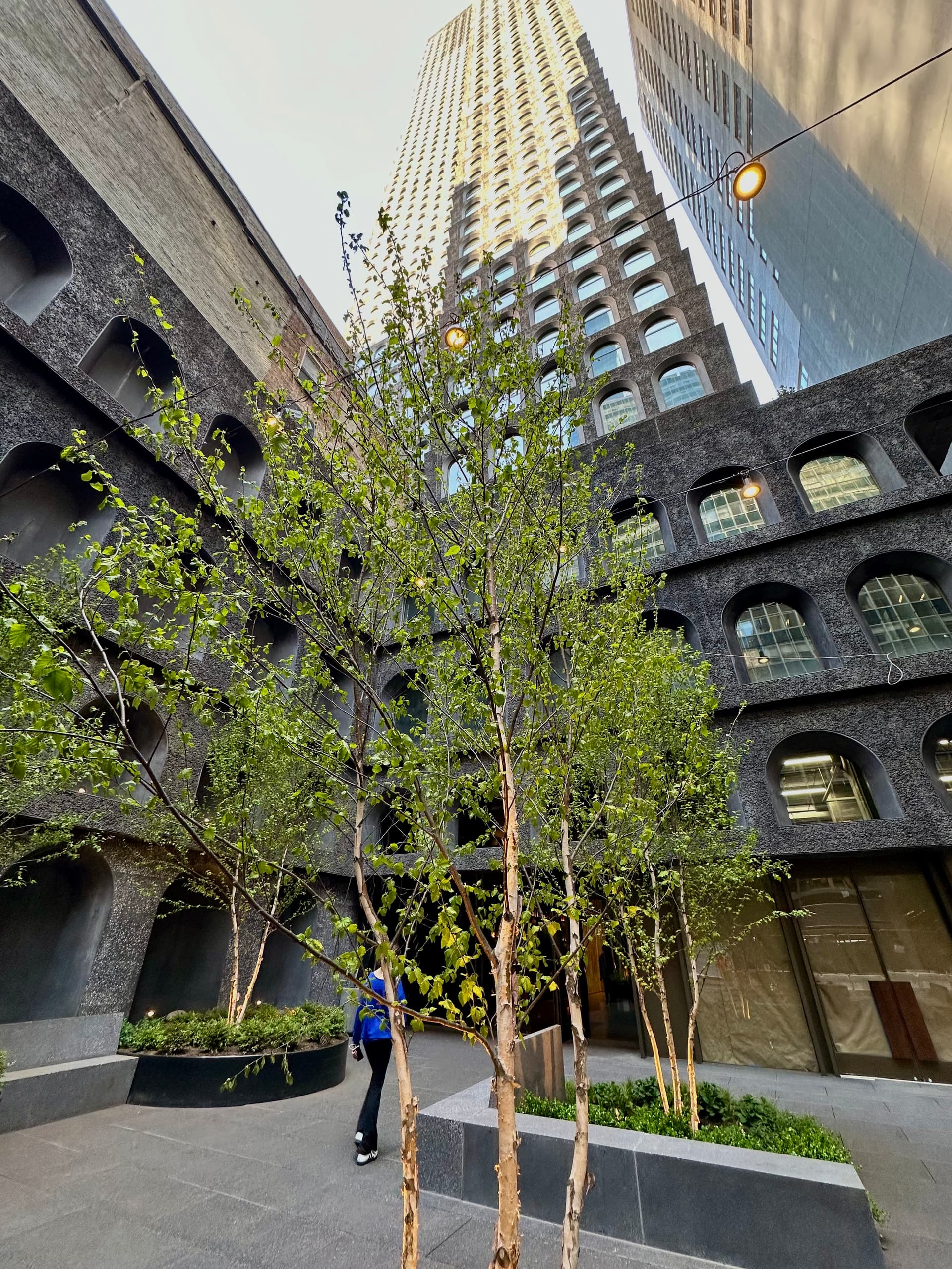
I really love the facade of this building up close–dark and brooding, rich and textured. Texture is sadly a quality that is too often neglected in architecture–but here the facade looks tactile and full of depth, the texture giving the panels a nearly handmade-looking feel as opposed to the mass-manufactured smoothness of glass or steel. The arched windows and roughness of the facade are evocative of the gritty industrial past, but the height of the tower and repetition of the facade is unmistakably modern. So, up close, this tower gets an A+ from me.
Unfortunately, the tactile qualities of the facade quickly disappear from a distance, and from afar the tower looks like a giant gray tombstone. Perhaps I’m misremembering, but didn’t the earliest renders have bronze accents around the arched windows? That would have done a lot to alleviate the “tombstone” look on the skyline.
Overall, I’m in favor of this tower, despite the fact that it looks gray and depressing from a distance. I see a lot of people calling it an eyesore or whatever upthread, but despite the tombstone resemblance I will take this over glass any day. A few blocks away from this tower is another residential building called 19 Dutch that has ugly cheap glass and garish patterns on the facade. That kind of tower, to me, is the true eyesore. I will take a semi-failed experiment in “starchitecture” like 130 William over a cheap banality like 19 Dutch any day.
The courtyard will look much better at night with the glow of the lighting. It really could have used some brass or gold accents for a warm pop of color besides the trees. Its going to look really gloomy in the winter.