


The ‘splash page’ on this website brilliant. It is as if the art video was done by Claude Monet, and the sound track by Cole Porter.
The developers on this are covering all the basis: Architectural desing, website design; and even the interior design is classy.
Nice… ![]()
BTW. I have 4 other posts on this topic. Click on my infoshare tag above to see the other links/photos/comments.
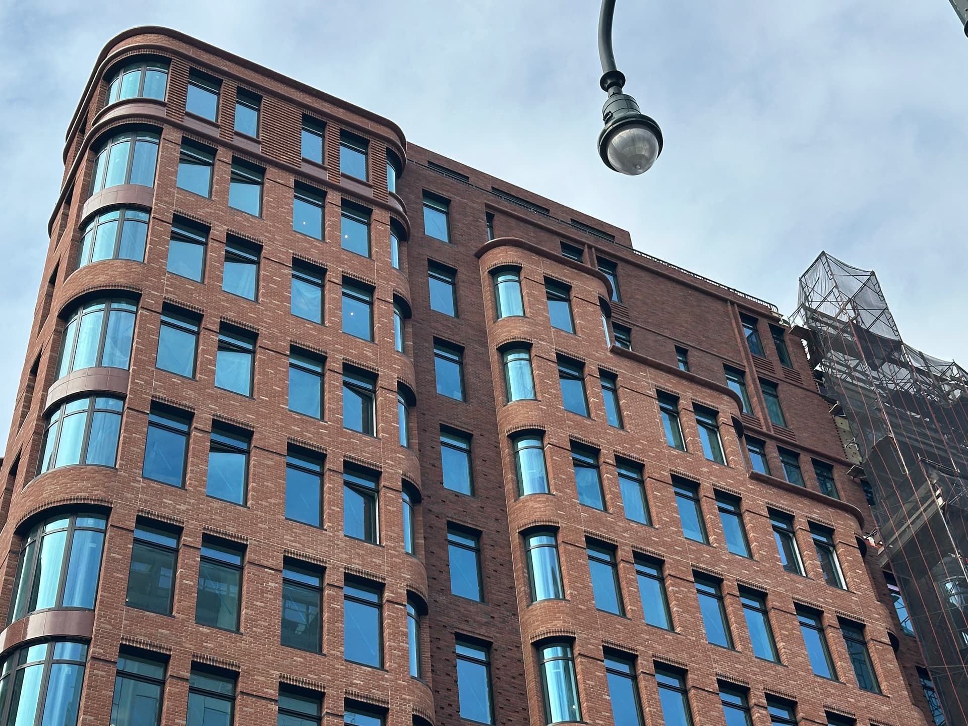
Tastefully done. The brick work and the rounded corners/windows. My only gripe is the asymmetrical window placement at the top but thats just nitpicking.
I was wondering about that too. It is a bit quirky, but somehow adds to the appeal. There must be some sort of structural or functional factor that required those odd window placements.
I do think Form must compromise when it comes to optimal function. The Vitruvian Triad again: Utility, Solidity and Beauty - Utility before BEAUTY… ![]()
![]()
![]()


Gorgeous!
14th St classing it up!
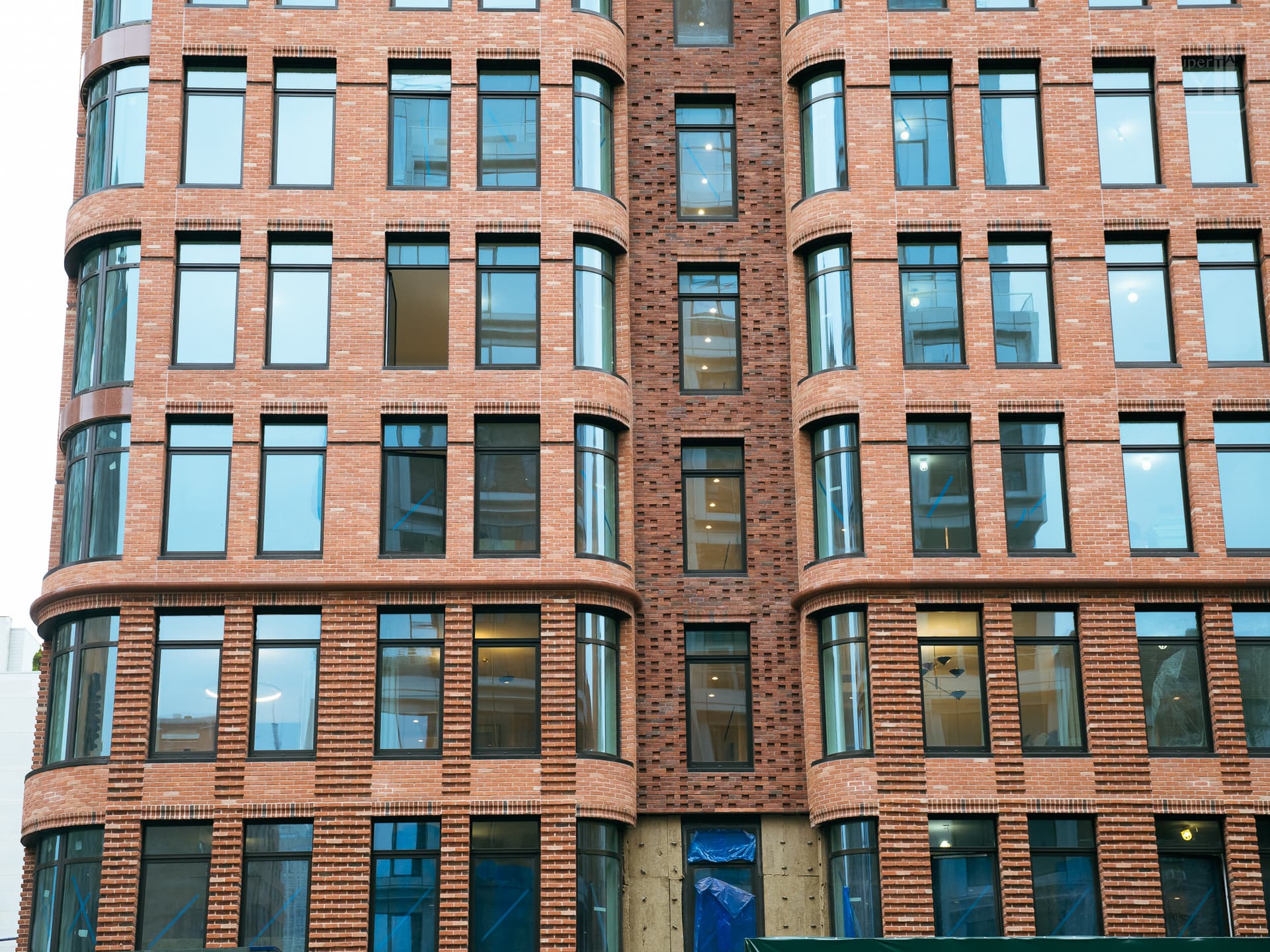


Modern architecture that looks kinda Classical. Those ‘No-Mullion’ windows are the best, and growing in popularity in new condo construction. I KNOW that they uses prefabricated brick panels on this facade: and they look great.
Honestly, I could not even tell if they were hand-laid bricks as seen at the Willow Condo - only for the info found this YIMBY forum I know for sure they are brick ‘panels’.
This is the Willow Condo - hand laid brick, and hard to tell the difference. ![]()
These are also hand laid.
BTW, I love how the windows open up all the way like I’m seeing in the first photo. I know it’s probably code but I hate the windows that only open like 3-4 inches.
Yes, that fully opening window is a cool feature. I think this window will be getting some sort of ‘limit setting’ mechanical attachment; it just looks like a “code” or safety violation.
However, I was wrong about the brick panel facade; so may be wrong about this too… ![]()
PS. Looking at that open window you pointed out in your photo reminded me of this tragic incident; many years ago -
The safety locks will eventually be put on to where it cant open more than 4”(which yes is a code related thing), they are unlocked fully to allow for cleaning.
My window on the 73rd floor of the ESB used to open all the way up -it was amazing. Now they’re screwed shut. Such a bummer
That’s a shame but I get it.
I did not realize that was a function/feature of the windows: opening up full swing in order to be cleaned. The upper transom section of the glass can then also be easily reached with a squeegee while standing inside the apartment. This is a great feature; not need for dangerous or expensive window washing: be it a mechanical boom, or Mountain Climbers.
The fact that these windows have a safety feature on all-the-time and open only a few inches is also smart: one only needs to have the window open ajar to get some good fresh air ventilation.
One some other buildings, I am noticing around town the ‘Mountain Climber’ crews who repell down from the roof on a single rope; that seems crazy dangerous, and massively expensive.
Everything about this new condo at 525 6th Avenue is brilliant & beautiful: the “total package” as the saying goes. ![]()
Photo ‘Mountain Climber’ window washers working at SOME OTHER building in NYC that does not have SMART WINDOWS.


Nice ‘streetscape’ photo - this building actually looks perfectly situated on that corner. ![]()
I think of this new condo building as being a Contemporary Castle: it is both modern and majestic. The Developers/Designers/Builders have created a masterpiece with this project.
Oddly enough this building also manages to blend in nicely with most of the surrounding older buildings on the block; there is touch of modesty about 525 6th Avenue despite its iconic architectural design.
Quote -
AI Overview
What Is a Streetscape and Why Builders Should Care - BUILD …
*A streetscape is the visual and functional environment of a street, encompassing all the elements along it like the road, sidewalks, buildings, trees, lighting, benches, and public art. It is a combination of the “natural and built fabric” of a street that creates its overall character, feel, and experience for people who use it, whether they are walking, cycling, or driving. *
REVISED End Quote.
I see we’re back to the lengthy AI quotes.