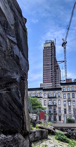
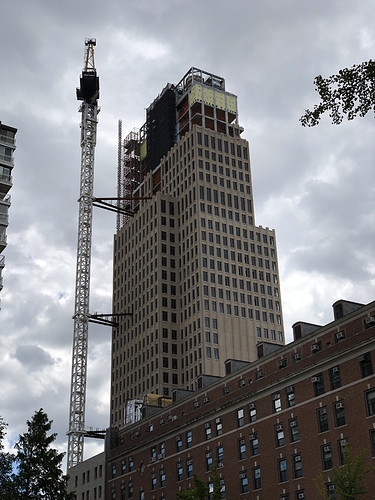
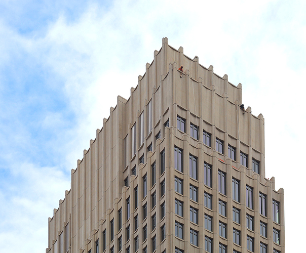
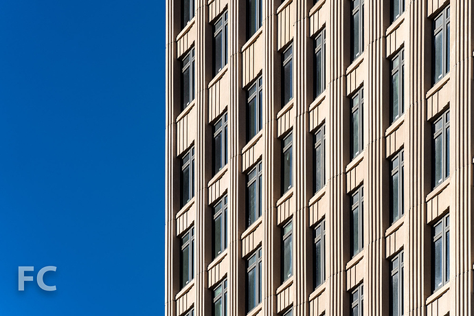
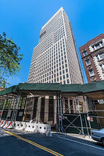
Is this tower symmetric? The facade panels have detail but it’s repetitious and the overall effect is flat. Hopefully the finished product will have a better effect.
Just saw this building. A fantastic example of modern modular curtain wall and reinforced concrete building technique being used to imitate classic prewar design
Way pre-war. It looks like it’s from Mesopotamia.
Exactly. The super structure (bones) are typical formwork reinforced concrete, and the curtain wall (skin) are the large modular stone panels with punch windows that they hang on the facade. I have noticed lately that there are long flat bed trucks parked along broadway at about 120th, all loaded with these modular stone panels waiting to be hoisted off with the crane. This type of construction technique makes for a very solid and substantial looking building facade: much like the solid masonry construction of prewar buildings. I am in this area often and was waiting to find out about this building as I did not know the exact location: glad to see the news has surfaced on this thread.
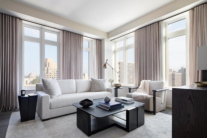
Looks like a render!
It’s amazing to see something like this sprout in this area. Broadway has such great potential all the way through 165th by the hospital. I’d like to see this diamond in the rough polished.
That is the bell tower of Riverside Church coming into view out of those windows; the most beautiful Church on Manhattan Island. That interior is very inviting: simple, smooth surfaces - elegant. On the good/better/best scale of NYC residential condo real estate development this project rates ‘the best’.
NYers obsession with classical and art deco architecture – design that was out-dated in 1925, but is somehow still being built in 2021.
I really hope NYC decides to join the 21st century at some point.
Totally disagree. NYC is the only city on earth with a wealth of prewar highrises, and the only city on earth still producing quality prewar-style designs. Generic highrises can be found anywhere, from Warsaw to Melbourne to Santiago, and are uninteresting.
And it isn’t like NYC lacks in modern designs, it just happens to have some prewar-style builds too. Neighborhoods like West Chelsea (High Line) and Williamsburg are thick with modern builds.
I love Art Deco. Nothing “outdated” about it. I hope more skyscrapers with designs inspired by Art Deco are built.
Architecture like so much else is cyclical. Some designers are tired of putting up modern glass stuff and are looking to riff on older styles in new ways. Stern is a perfect example. His recent work certainly riffs on classic motifs but with tons of new touches. Just look at his window sizes for starters. Even SOM is showing signs of style shifts. About time. Others are too; just look at all the good cantilever work (not the stuff done just to make money with extra space). And the Hiline area is filled with new riffs on modernism. It’s often a joy to behold.
I invite you to go see the interior of the 1 and 2br units of this building. The lack of windows and abundance of large pillars make every single layout feel cramped. To each their own, I guess. I just see such a wasted opportunity for the UWS to provide what actually feels like a modern home.
MKH–Exterior building styles are not automatically related to cramped and unworkable interiors. Classical does not mean the apartments are unpleasant places to live. Small cramped spaces can exist in modern glass buildings too as we discovered the last time we looked for a place to live in the city. Some architects are good and others aren’t, regardless of style. And that’s been true since the memory of people runneth not to the contrary. So it goes.


