I was getting 5b vibes from this one.
My kind of light JC - and nice Ektachromesque color adjustment there too lol.
Disco night at One Vanderbilt! ![]()
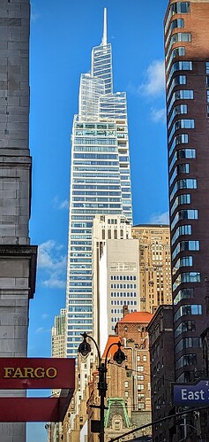
I understand the need for ultra-clear glass at the observation deck, but those floors really stick out.
Agreed. It really detracts from the look of the crown in my opinion. A seamless transition would have been so much more pleasing.
The glass at the observation deck level kind of disconnects the crown from the rest of the building. It’s not a seamless appearance. For me that’s the only issue I have with an otherwise stellar building.
I can imagine the developer pushing for this type of glass…
SL Green is the one who wanted the glass to stand out from the rest of the building to better the observation deck, but they worked closely with KPF to find a good solution. I personally don’t think it’s as bad as everyone is saying.
Thought the glass itself is not tinted and is almost colorless unlike the other panels that cover the building, and apart from all the colorful lights that emanate from the floors at night, the mirrors and differently colored portions on all 3 floors are more what makes the discrepancy, not the glass itself. It’s not the envelope making the observation deck more noticeable, it’s the interior elements.
I agree the mirrors stand out as a sore thumb, but the ultra-clear glass makes the problem even worse.
I don’t think there would have been a way around that, I’d assume that all parties involved (SLG, KPF, & Snohetta) saw that having the glass be like the rest of the tower would have absolutely changed the experience that the OD has in being in the air because of that tint. The mirrors do have an aqua-ish tint, which is typical of mirrors, that also makes it more appearant.
I wonder how different the observatory experience would have been if they had used the same glass as the rest of the tower?
It’s clear that they prioritized the observatory over the exterior appearance of the tower.
I think that it would have had a blue tint instead of being whatever color the sky is, which certainly would have impacted sunset colors. And the transparency of the glass certainly adds to the affect that there is no glass.
I don’t mind the visual separation but I do agree it exists and makes the crown “float” at times. Sometimes I don’t like totally blue walls of endless glass but forget that new buildings are designed for the occupants.
And the observatory, which is a money maker in a slowly growing competitive field, definitely would want to prioritize the views looking out.
this tower has such a powerful silhouette. But those observatory floors really do ruin the consistency of the facade.
Good to know I’m not the only one. Looking at that picture, the observatory floors are not the only problem; it is also the change of the pattern of the bands on the façade…I know I’m being picky, but it is only because I have this tower on a different standard than 99% of the building in our city.
The terracotta bands in particular are supposed to gradually thin out until they are omitted on the last finial. So I don’t think that aspect should really be picked at.
Ha! i can see that now, but I don’t think the transition was as successful as planned.


