Earlier today


8 Likes


7 Likes
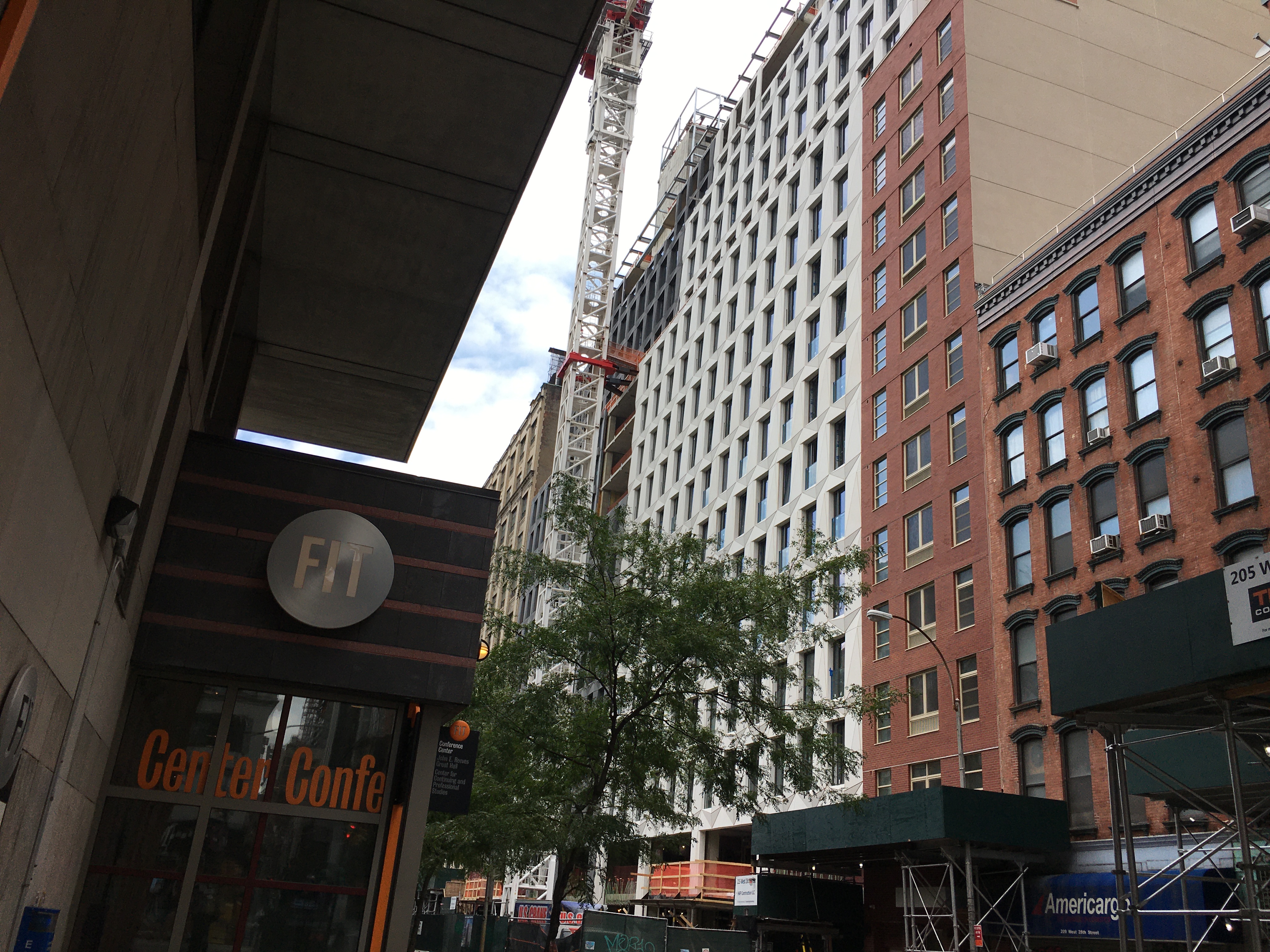
This is super cool cladding: heavy masonry, concave/convex, nice geometric pattern,12" thick at least, contrasting neutral colors. I particularly like ‘punch windows’ if they are large; as opposed to the floor-to-ceiling glass curtain wall. This is a truly artistic looking new building that goes above and beyond the generic: so bravo.
Speaking of generic - take a look at the newish red brick building directly next to this beauty. That plane Jane is the perfect foil for this fantastic looking facade.
1 Like
Has this one topped out yet?
6 Likes
They made all the right design choices, those heavy stone panels look great; and simply attaching the large prefabricated panels make for fast and efficient construction of the facade. This is relatively low-cost construction process while pulling off a ‘high-design’ look with those diamond geometric forms making the appearance of the facade ‘pop’. My only critique is that one color would have been better; more cohesive.
2 Likes


4 Likes
I see now how that two-tone facade is better than keeping the whole building one color: the geometric pattern of the facade seems more prominently on display this way.
I respectfully withdraw my former criticism of the two-tone color choice for the facade. ![]()

3 Likes
Complete
3 Likes

1 Like