It’s quite possible all of this is happening exactly because of the developer’s ego. Larry probably has the fear that he won’t see 2WTC rise. When the dude was born the Empire State Building was being erected!
Perhaps that’s why there has been all these compromises so he can get it off the ground before he takes a long dirt nap. Instead of building something grand to send himself off with a bang, he’s opting to get it completed no matter how it looks so he can finish his checklist.
Wish the PA had some terms in their agreement with Silverstein to make this easier. It seemed strange to me how 1WTC was developed separately from 2, 3, and 4, but now I wish something similar would happen with 2WTC so we could get a shot at having a fresh take on the concept.
Anything to provide visuals for the public, to flesh it out. Literally after I put the model on my WTC model I said “awww what the fuck”.
Also it looks like two different designs are shown in those renderings, notice the placement of the open spaces on the west and the top two tiers of the crown
I still don’t understand what was so “outdated” about the diamond design. The lack of outdoor green space seemed to be the main issue with the diamonds that the later designs tried to rectify. But One Vanderbilt doesn’t have any green space and it’s practically filled with tenants already. Same with Manhattan West - no trendy balconies and they’re still a hit with tenants. In fact, the basic design of Manhattan West is nearly as old as the original 2 WTC (renders for towers 2,3, and 4 WTC were revealed in 2006, while Manhattan West has been in planning since at least 2007). And yet you never heard a peep from Brookfield about Manhattan West being “outdated”.
this might be an unpopular opinion but i like this new height. it keeps Libeskind’s original view for the WTC complex to step up towards 1 WTC when seen from the Statue of Liberty. I also think it allows One World Trade to stand out more which i’m a fan of bc it looks so much better then the crappy design they’ve chosen for 2.
They can easily use the top of the 2006 design podium as a terrace (one of the biggest in the city’s CRE), and slap an auditorium below it as in the 2020 model we’ve seen.
Slap some gardens+dining at the diamond crown to make amenity use of these floors and that’s the perfect design.
There’s very little sense in this project.
Some have mentioned that the floorplans aren’t practical, but they’re just as good as any other in the city, and the new design has the same core and collumn configuration roughly so they didn’t improve a thing. It had 3.1m RSF
The 2006 design is still by far the best and most timeless design presented to date. It would be an iconic addition to the complex / skyline and give some much needed umph to the Trade Center. These latest proposals are garbage. I’d even take BIG’s over this sh*t (though they should just go back to the 2006 design which ironically was designed with banking and financial firms in mind - hello AMEX).
Yes the original design was so elegant and powerful. It’s still my favorite of the group.
Like others have said in this thread hindsight is 20/20 and I have to say my second favorite design was BIG’s. It was contentious because it looked like it was leaning at several points and felt like it had its back turned to the site. It did however have the proper “bulk” element to fill the void of its predecessor. I know it likely would have been value-engineered out but my favorite part was the scrolling marquees when you looked up at it. I’m a sucker for details that can only be appreciated at street level and this had a nice payoff:
I agree, in hindsight BIG’s design complemented 3WTC and 1WTC very well. For me it’s only slightly behind the last Foster design for my second favourite 2WTC iteration after the original diamonds – they have a pretty similar massing, but one with horizontal emphasis and one vertical.
My problem with the new revision is that the bulk of the tower is now below 3WTC’s roofline, with only a dinky thin part barely rising above it. It might technically fit Libeskind’s spiral but on the skyline it has a lot less visual impact than even 3WTC, ruining the flow from 1 to 4.
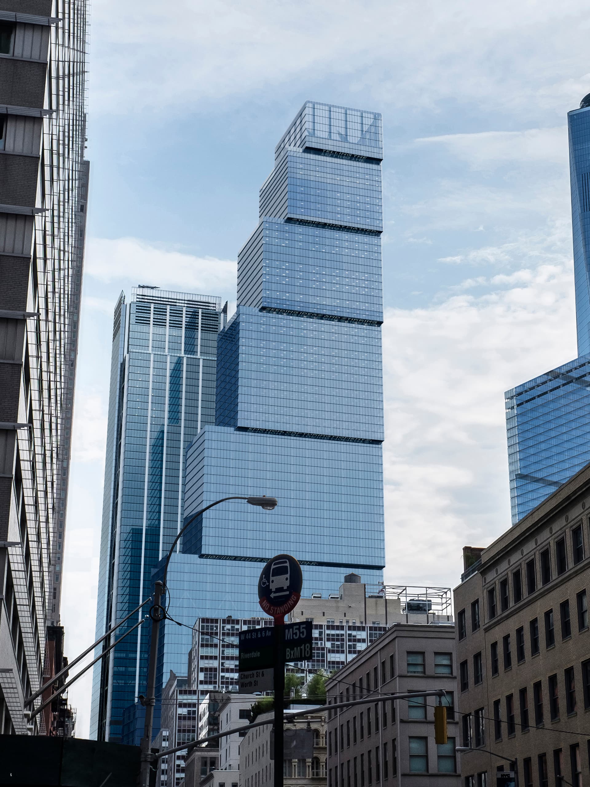
A new redesign has been revealed for 2 World Trade Center, the final supertall component of the 16-acre World Trade Center complex in Manhattan’s Financial District. Designed by Norman Foster of Foster + Partners and developed by Silverstein Properties, the skyscraper is now slated to stand 62 stories and 1,230 feet tall, down from the 80-story, 1,348-foot-tall scope of the previous iteration. The building will yield 2.8 million square feet of office space and rise from a full-block property bounded by Vesey Street to the north, Fulton Street to the south, Church Street to the east, and Greenwich Street to the west.
The main rendering above showcases the overall World Trade Center complex with 2 World Trade Center in the center. The scaled-back skyscraper is depicted culminating in a tall white spire, though apart from this the general design language has been left unchanged. This includes the signature use of stepped setbacks on the eastern elevation and staggered loggias on the western face, which will all make space for 12,000 square feet of landscaped terraces.
The below image from across the Hudson River shows 2 World Trade Center’s roof level reaching approximately 1,100 feet, slightly higher than the 1,079-foot-tall parapet of RSHP’s 3 World Trade Center to the southeast.
The way I see it, this latest iteration is the one they need to hit the ground running with yesterday.
The last staggered-box version was too blocky for my taste and disrupted the relatively simplistic architectural progression of the other elements. This one is cleaner, the spire adds a new visual aspect wherein 1 and 2 have spires, whereas 3 and 4…Well…
Anyway, another thing I noticed in this design is the unintended resemblance to the original 80 South design. Maybe that should’ve been resurrected by Lord Foster (with Sr. Clatrava’s permission, most likely) and LNF could’vee run with that ball.