Today. Nice day for paddle boarding down the Hudson.

14 Likes
Great angle for 1 Vanderbilt. Makes it look like Metlife is a pedestal for it.
3 Likes

14 Likes
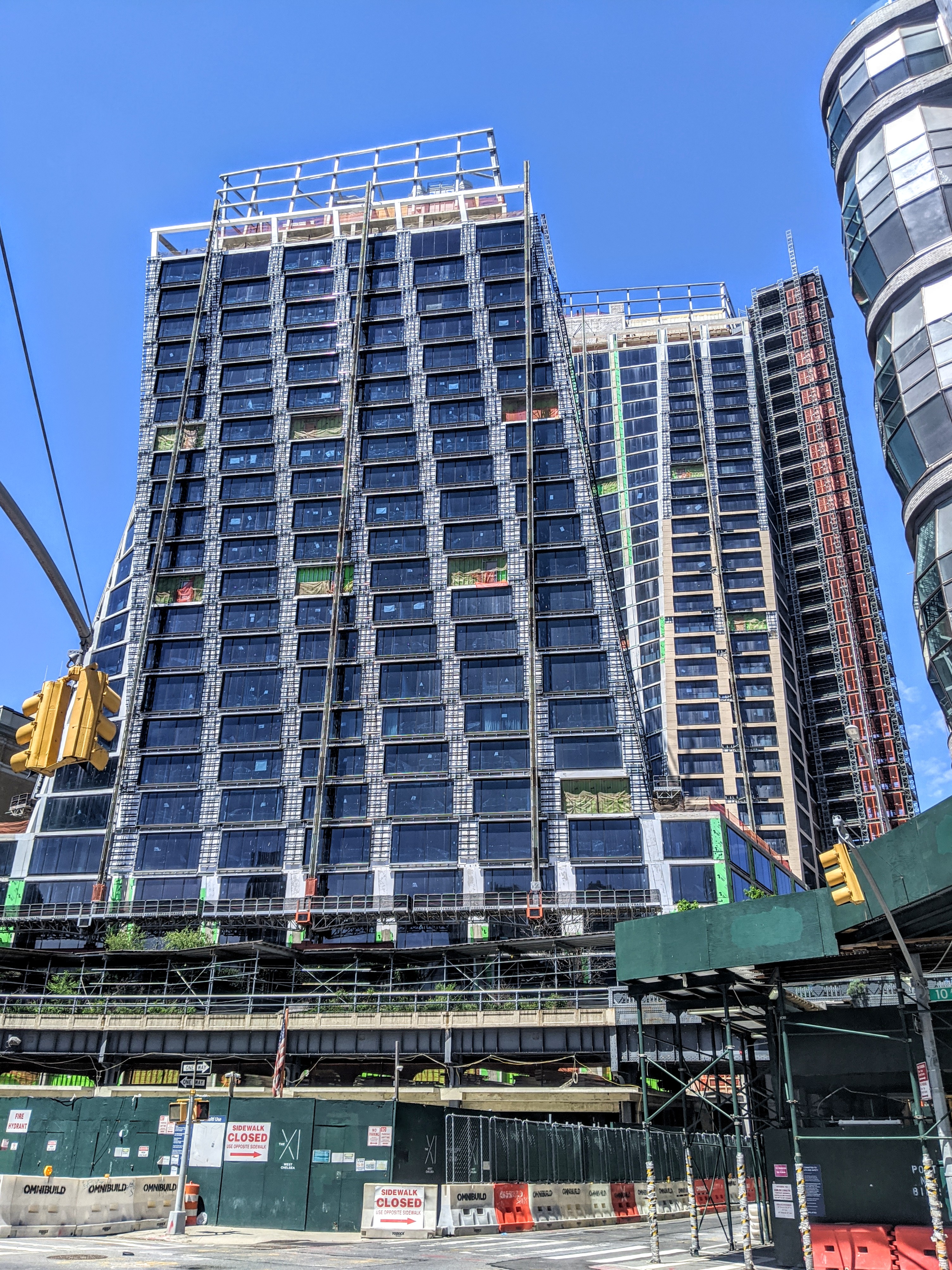
Crazy how long the facade is taking
2 Likes
I might be wrong, but I think this is slowed/suspended because of rona. Although it will be starting up next week(!)
1 Like
They’ve been working on the facade for over a year and they’re not close to done it seems. it’s not a huge building
2 Likes
the developers also have ties to the mafia, so dirty money may be involved. ![]()
2 Likes
The Israeli and Russian mob is a big problem in NY.
2 Likes
Beyond that, this building complex is not selling well so they just don’t have the cash to speed things up.
2 Likes
Maybe, just maybe people are not rushing to live in a building that looks like it will fall over.
4 Likes
Aside from the Twin Towers reference the geometry of this building up close and in person kinda makes me queasy. Something alien in its design and I can’t explain it. The proportions from ground level are awkward.
5 Likes
I had great hopes for these buildings so all this is sad for me.
2 Likes
I agree, though I think the vertical scaffolding lines during construction are what makes it so uneasy on the eyes, as you can tell something is “off”. I hope once it’s complete that it will look more elegant
5 Likes
Never particularly liked these buildings. Maybe my angst comes from two characteristics of the design. First, the facing’s discontinuity comes off as somewhat chaotic and uncomfortable. And second, the design has nothing in it to counteract either the perceived tilt or the discontinuity. There is nothing to bring our eyes to something like a normal perspective. So it just comes off as unbalanced and disjointed. Much contemporary art has similar features but the best of it typically gets ours eyes to move around rather than just tip over. It’s another case where fancy engineering to create a first cousin to cantilevers fails to take design coherence into account.
7 Likes
The moral of this story is don’t hire an architect that does a lot of acid!
1 Like
LOL. Maybe s/he should have taken more.
1 Like
The problem here is that this style does not work well for relatively short towers like these. There are examples of taller towers with twisting forms that look awesome.
As a starchitect, he should know that.
4 Likes
Also from most angles it doesn’t even really look twisty, moreso just slanty and leaning, which is just not that visually appealing.
Also the color of the glass doesn’t fit, should have been a much light color.
Overall it’s quite decent imo and it definitely elicits a reaction and commentary from anyone who lays eyes on it. Everyone stops to look up in awe (bad and good). I’ll reserve final judgement when the cladding is done and the scaffolding removed as this is a building that really needs to be seen with clean lines to be appreciated.
4 Likes