4 Likes
I don’t like this project. Sure the curves are nice, but I cannot get over those concrete strips. And frankly I think it’s too small. Yes I realize how tall it is, but this is NYC and Downtown, too small.
If I was a billionaire I’d demolish it, go and get shvo and build his original plan (the one from way way back, 1,300 something feet.). If that’s even possible now.
But just another dream of mine.
2 Likes
This delay is not due to either a design defect, or a construction defect. It is all about the financing, loan default, and the on going litigation stemming from those issues.
I have always liked the Architectural Design; simply a sleek, cool looking, refined modernist building.
Great design, good construction - bad financial planning. ![]()
3 Likes
The rounded corners and sheer verticality look very striking in person at street level. But I agree with @mcart that the concrete is a disaster, especially on the skyline, where it’s most noticeable. If only they had gone with something else there–I think I mentioned earlier that metal cladding could have been a witty, post-modern flourish by creating the impression of a giant I-beam–this tower would be a winner in my book.
I hope they’re prepared to frequently power wash those tall concrete walls, overtime with weathering and moisture stains this won’t age well.
I think that’s expected with any bare concrete that is exposed to the elements, but there are things that can be done to mitigate having to do that as often.
I don’t have anything against this tower, but that the top could have been designed better. But as HerrDavid said, I think putting some type of metal cladding on the concrete could have been a nice design opportunity, bare concrete isn’t always bad, and it looks nice when done well. The concrete looks uniform between pours and uses the same dimensions as the windows, Vinoly also wanted to express the formwork ties in the concrete.
1 Like
I understand the objections to that raw exposed concrete; it is a look I like - but most do not…
I took this photo from another thread here on YIMBY: a building that is currently going up on 96th street.
This is the type of treatment this vertical section needed to become a true ‘crowed pleaser’.

It’s still just a blank wall.
1 Like
I agree with stache, its just a blank wall, but not comparable to the bare concrete walls on 125 Greenwich because these blank walls are party walls, they will eventually be covered by other developments so it doesnt matter what they looked like, but in that case they were covered with the facade material of the other sides, the bare concrete strips on 125 will never be covered by another abutting development because there is none, a street is on one side and a landmarked building is on the other.
1 Like
The raw concrete surface is intended as a ‘decorative finish’ - I like the look. The stark contrast between the smooth shiny glass, and the rough raw concrete is the aesthetic juxtaposition the Architect wanted to achieve.
The blank wall part could not be avoided as it is the mechanical core; but the raw concrete was a risky move. ![]()

3 Likes
For me, it’s not raw concrete per se–I like brutalism after all! ![]()
It’s just that in this particular case, the concrete clashes badly with the smooth, highly refined glass surfaces (with the result that the building will forever look unfinished to my eye).
This visual mishmash could very well be Viñoly’s explicit intention and not the result of VE or some other non-aesthetic consideration. After all, he’s been wrong before. ![]()
2 Likes
Raw concrete is really hard to keep clean and look good over time. FIT is a prime example.
1 Like
@infoshare The bare concrere walls are actually not part of the core, its still in the center of the building. They are just acting as shear walls, there’s usable program behind them like bedrooms/bathrooms.
@HerrDavid I don’t think it was value engineered, atleast from the point of the design not changing since this particular design came about. It’s definitely intentional since Vinoly likes to show concrete in some of his projects, like 432 Park Ave and the Ritz Carlton.
Overall I think the building would look the slightest better if it was just finished and the black mechanical banding was added to the upper section as it was in the mid section, there’d be less exposed concrete at the top at that point. Still not a very exciting termination though. I think it would’ve looked better if the glass had just continued and stopped where the concrete stops.
2 Likes
That raw concrete section also could have been polished to a smooth glossy finish: now that would have looked even better. The cost would have been astronomical; and the dust containment probably ‘impossible’.
Beauty is in the eye of the beholder, and I like this beauty as is - raw concrete an all… ![]()

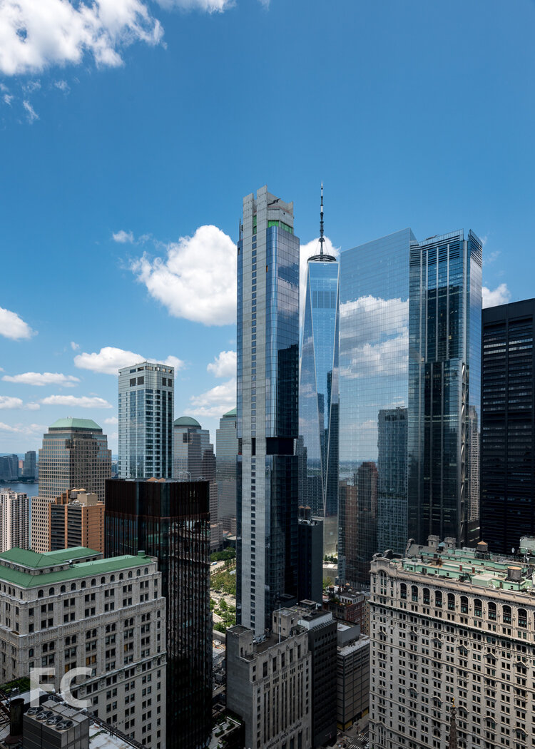
i’m pretty neutral on this. I like the curved glass and high quality concrete doesn’t really bother me plus it allows it to stand out against the mirror that is 4 WTC. I really like how it adds to the spiral effect viewed from Trinity Church.
5 Likes
I like the concrete strips running up the tower, but I think the top looks like an afterthought. The vertical concrete walls are quite dramatic-looking from ground level and really draw your eyes upward…to a rather bland crown.
4 Likes
1 Like
Man what is going on with this. Didn’t they recieve funding to finish it?
1 Like
I was under the impression it was stuck in bankruptcy proceedings. The overseas money that was supposed to back it is out of the picture and other investors are waiting to see if it will be auctioned off on the cheap
1 Like